In my introductory article on this series I talked about using SHOW_ALL scale mode for my game which fits perfectly for need to be responsive. It will resize the game to fit into available space using the original aspect ratio which was used to develop the game. The only issue I saw was the “letter-boxing” effect so if device’s aspect ratio was different than the game’s aspect ratio, there will be blank space around either horizontal edges or vertical edges.
We can account for that extra available space when loading new game and positioning of all ui controls can then be done relative to available space which is similar to how we handled RESIZE scale mode. The only difference here is that it can only be done once in SHOW_ALL scale mode when the game is initialized. In mobile app this is not going to be a problem and we can optimize our game for only one orientation and no resizing will occur once the game is loaded.
Now let us jump onto deciding game resolutions. We need to take into account the available width on mobile as well as pixel-density. In your HTML file make sure to include viewport meta tag which can be used to control area in which game is shown. Most responsive amd mobile friendly web pages have following viewport definiton
<meta name=”viewport” content=”width=device-width, minimum-scale=1, initial-scale=1, user-scalable=no”>
Setting width to device-width ensures you get your device’s logical CSS width.
Second factor to consider on mobile devices is devicePixelRatio. This can be obtained by calling window.devicePixelRatio property. Mobile devices have more pixels than the logical CSS width. For desktops devicePixelRatio is 1 but for mobile devices, it is normally greater than 1 so we normally have more pixels available to draw our game on mobile devices.
We have two options here. We can ignore devicePixelRatio and only consider the game size according to CSS width and height which means that we are creating games for lower resolutions and game may not look crispy enough which is fine for most of the games.
The second option is to multiply devicePixelRatio to CSS width and height to get actual pixel width and height and draw the game for actual pixel width and height and then resize the game to fit into the available space which will look better on high resolution devices (did I say retina display?).
I am going to take devicePixelRatio into account and make my game look more crispy at the cost of some performance hit which I have yet to measure how much? So we get device width and height and then multiply it with devicePixelRatio and get pixel width and height and use that to initialize our game.
We are also going to make the game according to the device aspect ratio and not the game’s aspect ratio which we used to generate our assets.
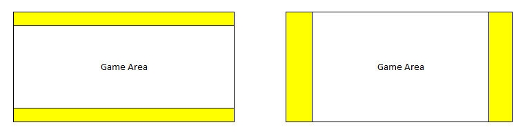
Let say we planned to create game assets for 960×640 which has an aspect ratio of 1.5 so all assets will be made accordingly to fit into this area. Now if we get a device which has an aspect ratio of 1.6, then we have extra space around vertical edges so calculated new width of our game would be 960*1.6/1.5 = 1024 and size of the game would be 1024×640.
If we have an aspect ratio of 1.4, then we will have space around horizontal edges and game height will be calculated to 640*1.5/1.4 = 685 and game size would become 960×685. You can see in our game we are just getting some extra space either on horizontal edges or vertical edges so game assets will have no issues being displayed in full. The only change which will happen would be their relative positioning which will change for different aspect ratios. In the diagram below the area highlighed in yellow is the extra space we get in our game which we are going to include in the game. The middle section (Game Area) is the planned game size
We will prepare our assets for two resolutions. 960×640 and 1350×900 and then decide which resolution to use on a particular device based on the pixel width and height of the device. Let us look at the code below
var mygame;
var globalParams = {
	calculatedWidth: 1350,
	calculatedHeight: 900
}
var GameResolution = {
    _1350: 1350,
    _960: 960
};

function calculateSize() {
    // Get Pixel Width and Height of the available space
	var w_w = window.innerWidth * window.devicePixelRatio;
    var w_h = window.innerHeight * window.devicePixelRatio;
    var g_w = w_w;

    // We prepared all assets according to aspect ratio of 1.5
	// Since we are going to use different assets for different resolutions, we are not looking at the resolution here
    var originalAspectRatio = 1.5;
	// Get the actual device aspect ratio
    var currentAspectRatio = g_w / w_h;
    if (currentAspectRatio > originalAspectRatio) {
		// If actual aspect ratio is greater than the game aspect ratio, then we have horizontal padding
		// In order to get the correct resolution of the asset we need to look at the height here
		// We planned for 1350x900 and 960x640 so if height is greater than 640 we pick higher resolution else lower resolution
		if(w_h > 640){
			globalParams.selectedResolution = GameResolution._1350;
			globalParams.calculatedHeight = 900;
			globalParams.calculatedWidth = w_w * (900 / w_h);
		} else {
			globalParams.selectedResolution = GameResolution._960;
			globalParams.calculatedHeight = 640;
			globalParams.calculatedWidth = w_w * (640 / w_h);
		}
    } else {
		// If actual aspect ratio is less than the game aspect ratio, then we have vertical padding
		// In order to get the correct resolution of the asset we need to look at the width here
		if(w_w > 960){
			globalParams.selectedResolution = GameResolution._1350;
			globalParams.calculatedWidth = 1350;
			globalParams.calculatedHeight = w_h * (1350 / w_w);
		} else {
			globalParams.selectedResolution = GameResolution._960;
			globalParams.calculatedWidth = 960;
			globalParams.calculatedHeight = w_h * (960 / w_w);
		}
    }
}

window.onload = function () {
	calculateSize();
    mygame = new Phaser.Game(globalParams.calculatedWidth, globalParams.calculatedHeight, Phaser.AUTO);
    mygame.state.add("Boot", boot);
    mygame.state.add("Loading", loading);
    mygame.state.add("MainMenu", MainMenu);
}
You will notice we are preparing the game according to pixel size of the device which will then be resized to fit into available space. In the next article we would look into creating game screen and positioning of controls on the screen which is very similar to how we did it in RESIZE mode.
Check out the desktop version of the game here.