I first started reading about Phaser around 5 months back and since then I have been planning to write games in Phaser. After studying some material online I finally decided to write a few games to get used to the framework. I wrote a few games which were more like practice games and then started digging further into it to make something more polished. Finally I decided to write a game and publish a series of articles as I encountered scenarios which I wanted to manage in the game but could not find enough tutorials for help.
Scaling the game
A very basic requirement for HTML5 games is to be able to scale to the resolution of the device on which the game is running. Since HTML5 games can run both on pc as well as mobile, there are thousands of resolutions and aspect ratios which the game needs to support. Now this is somewhat hardest part of the development process. I decided to make a game which is responsive, adapts to the screen resolution on both pc as well as mobile, and works for both orientations (Portrait as well as Landscape) in mobile. It did not turn out to be a trivial solution. There is some material available on internet which mostly talks about the concepts but there is not much available out-of-the-box to use and there is no one solution which can be used in handle it. There are solutions which fit into one type of games but would not work for another. It entirely depends on the requirements of a specific game.
Phaser has built-in support for scaling a game to fit size of the device. The ScaleManager in Phaser has a few options to scale a game out-of-the-box. One such option is to use SHOW_ALL property which resizes the game to fit into available space using the same aspect ratio which was used to develop the game. If the device has a different aspect ratio compared to the game, then after resizing there is going to be some blank space either around horizontal sides or the vertical sides depending upon which of the two aspect ratios is higher (game vs device). This is known as “letter boxing” effect. This option is easiest to use and does not need developer to do anything special. Just set the property and let Phaser handle everything else. Everything gets scaled up or down in the same ratio so the game looks fine for all resolutions. The blank bars indeed don’t look nice and need some more work to blend the game into the background. Easiest option would be to set a background in HTML which would simply blend with the game background and everything would look perfect. Another scaling mode using EXACT_FIT does not maintain the aspect ratio which means the game will be distorted.
The third option is to use RESIZE mode which creates canvas element for the game that is the same size as the parent container. This needs handling of the various elements in the game itself and that is the mode which can be used for making games truly responsive. We are going to explore RESIZE scale mode which has an extra feature of “Resize callback” that other scaling modes don’t. If our state has a “resize” method, it will be called every time size of the parent changes (change of orientation on mobile or, change of browser window size on pc).
As far as handling of orientation in mobile devices is concerned, one of the most common solutions used by development community is to lock one of the orientations in mobile devices and develop the game for only one orientation so when you open the game in other orientation, it hides the game and displays an alternate screen which could be as simple as an image asking you to turn the device. Though it makes perfect sense for certain games, sometimes it is desirable to be able to play the game in both orientations.
We are going to design the game which works for both orientations and scales to the available space. This blog will talk mostly about the display aspect of the game.
If you are new to Phaser, I would recommend reading some basic tutorials and get familiarity with the framework.
The first thing we need to decide is the placement of various elements. We are going to use Phaser “states” and will use a few states in the game and the first being the “Main Menu” screen. We want to display a “Title” and “Play” button and a couple more buttons for “Help” and “Audio On/Off”. The layout of “Main Menu” screen would be as following.
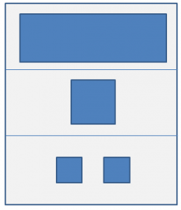
For simplicity we are going to divide whole vertical area into three equal parts. The top part will contain game title. Middle part will contain “Play” button. Bottom part will contain two buttons for “Help” and “Audio On/Off”.
Next step is to plan for the art work and pick a base resolution. All assets in the game should be prepared in the same proportion as the base resolution so when we scale all elements in the game, everything looks normal. There can not be any recommendation for a base resolution to use in the game. It totally depends on specific need of a game, target audience, performance, bandwidth etc. We are going to use base resolution of 1920×1080 for landscape (1080×1920 for portrait in mobile) and prepare assets for use in the game.
Next
We will look at some code and a demo link of our “Main Menu” screen in the next article.
This is exactly what i’m searching for. Thank you very much for sharing